
When building a sustainable wardrobe, understanding color theory can make thrifting and outfit planning much easier. I know it’s exciting to pick up everything you like in the thrift store, but buying random pieces that don’t match won’t curate a wardrobe that makes sense.
And it makes outfit planning more stressful and less fun. I’ve been there, done that, and ain’t doing it again.
So in this guide, we’ll break down how you can use color theory to shop smarter, create a harmonious wardrobe, and make the most of your thrifted finds.
DISCLAIMER: This post contains affiliate links and I may receive a commission if you choose to purchase. View the Privacy Policy for more info.
What Is Color Theory?
Color theory is the principle of using colors to create, enhance, correct, and visually balance something.
So when it comes to fashion and style, knowing color theory is important. Using certain colors for an outfit can help balance your look, or make a bold artistic piece.
Utilizing what we call the color wheel will help you decide which color you want as a base color, and which accent colors to choose to either balance or enhance the base color.
Why Color Theory Matters in Sustainable Fashion
Sustainable fashion is all about being intentional So choosing clothes that compliments your style and visually mix well with what you already own is the goal.
While shopping, use color theory to help you choose pieces that complements with you have in the cart AND in your closet.
It also creates a signature style with a consistent color palette. Meaning if you love and look fabulous in a warm tone pink, you can curate pieces that complement that color, such as gold, gray, black, beige, and purple, and other warm toned colors.
This will help maximize limitless outfit combinations with fewer clothes and allows you to shop smarter.
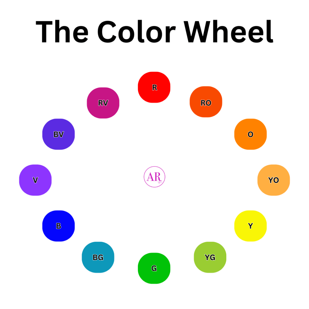
Colors Of The Color Wheel
The color wheel is a circular visual guide that consists of primary, secondary, and tertiary colors. To understand which is which, let’s break them down to a science.
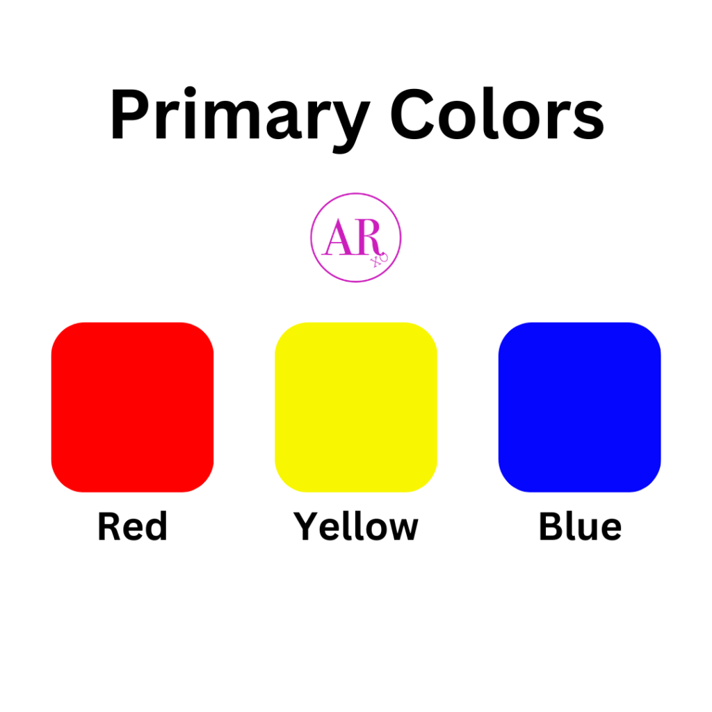
Primary Colors
According to the basic color wheel, the primary colors are red, yellow, and blue. These 3 colors can’t be created by any other color.
Think of them as the OG creators of all colors. When you mix the colors in specific combinations, you will make secondary colors.
Red is a bold color that exudes bold, fiery, confident, sexy, and fierce. It’s the type of color you want to wear to make a daring statement.
Yellow is a color that will brighten anything. Hence, the sun. Yellow conveys good vibes, cheerful attitudes, and uplifted spirits. Wear this color when you are feeling blue (sad).
Blue is the color that will calm any negativity. It’s also very regal, which makes you feel like royalty. But it’s also the sort of color that will make anything look cool.
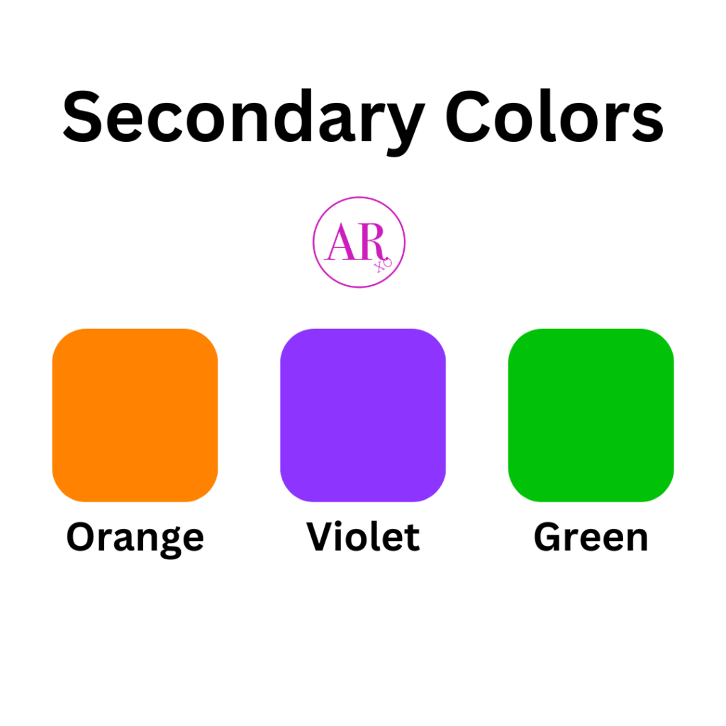
Secondary Colors
The secondary colors are green, orange, and violet (purple). They are created with these combinations:
- Red + Yellow = Orange
- Red + Blue = Violet (Purple)
- Yellow + Blue = Green
Orange is a mix of red and yellow, so you are bound to get a little bit of both their characteristics. Orange has the power to be fiery and bold, while also uplifting your mood. It’s a bright color, so it can put a smile on your face while looking at it.
Violet is such a cool color. With its color creators red and blue, you are getting a very sassy color that’s cool and bold. It also gives royal vibes like its creator blue, while so being considered sexy.
Green is the color of money. That’s what everyone says when viewing this color. Since its creator colors are yellow and blue, you will get a distinctive color that is somewhat bright, but calming at the same time. It’s an inviting color that goes well with neutral, earth-tone colors.

Tertiary Colors
Tertiary colors are colors created by primary and secondary colors that are next to each other on the color wheel. This is the fun part for me because you get an interesting color that creates a customized vibe. Here are the combos:
- Red + Orange = Red-Orange
- Red + Violet = Red-Violet
- Yellow + Orange = Yellow-Orange
- Yellow + Green = Yellow-Green
- Blue + Violet = Blue-Violet
- Blue + Green = Blue Green
The possibilities are endless with tertiary colors because you can create many color schemes using these colors.
What’s A Color Scheme?
Using the color wheel, you can create a color scheme, which is a combination of colors (2 or more) to create an overall style and vibe.
Depending on the colors you choose, you can create something that gives soft vibes, bold vibes, or something purposely overwhelming.
To help you create a color scheme for your outfit, let’s explore more on how to use the color wheel to find the best harmonizing colors.
Choosing a Sustainable Wardrobe Color scheme
When creating a color scheme, you have your basics, base colors, accent colors, and a pop of color.
- Base Colors (2-3 neutrals) – e.g., white, black, beige, navy
- Accent Colors (2-3 colors you love wearing) – e.g., soft pastels, jewel tones, or earth tones
- Pop Colors (1-2 bold shades for statement pieces) – e.g., a red jacket or mustard sweater
This strategy makes thrift shopping and outfit planning easier because you’ll instantly know whether a piece fits into your wardrobe or not and have fun playing with colors you already know and love.
How to Apply Color Theory While Thrifting
Now that you have a color palette, here’s how to use it while shopping secondhand:
Scan the racks with your colors in mind – Skip items that don’t match your palette to avoid impulse buys.
Mix neutrals & accent colors – A thrifted beige blazer can pair well with a green top and dark denim.
Try monochrome outfits – Wearing different shades of the same color (like navy and sky blue) creates a sleek, intentional look.
Use pop colors in accessories – If you love bold colors but don’t want them to dominate your wardrobe, go for thrifted scarves, bags, or shoes in those shades.
Focus on quality over quantity—choose well-made pieces that you’ll love for years.
3 Basic Color Schemes For Fashion
By using the color wheel and basic color theory, you will create a color scheme that will create interesting vibes for your outfit.
To quickly learn how to elevate your outfits, here are 3 color schemes to try today.
The three color schemes based on the color wheel are complementary, analogous, and monochromatic.
There are many other color schemes to explore, but here are the basics.
Complementary Color Schemes
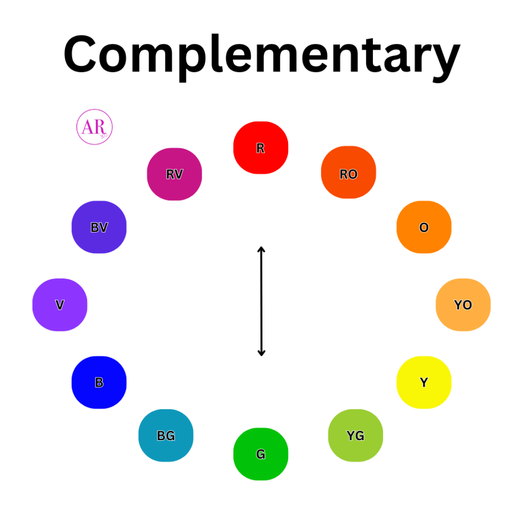
Complementary colors are two colors that are positioned across from each other on the color wheel.
When pairing the two colors together on an outfit, you will create a high-contrast look that’s immediately eye-catching.
When done right, you can create a balanced look by using a 60:40, 70:30, 80:20, or 90:10 ratio.
Meaning, use more one color as a base, and the other color as an accent. You can use equal parts of both colors, but be careful.
Depending on the vibrancy, tone, and shade of both colors, you can balance it out well. For instance, you can combine a red shirt with dark green pants and it will create depth, which would be a proportional look.
But if you combine a bright red shirt with bright green pants, the outfit could be too vibrant and loud.
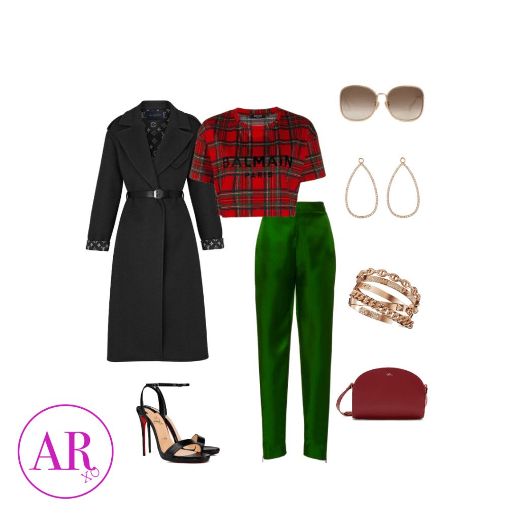
Shop This Look
Since the shirt and pants are close-fitted, this Women Elegant Notched Collar Double Breasted Wool Coat is great to give you an elegant shape. Get the Women’s Casual Basic Cap Sleeve Slim Fitted Round Neck Crop Top, and dress up the look with Women’s Satin Pants Dress Casual Pleated Pull on High Waist Pants with Pockets, and finish it with Women’s High Stilettos Open Square Toe Ankle Strap Heels.
Analogous Color Schemes
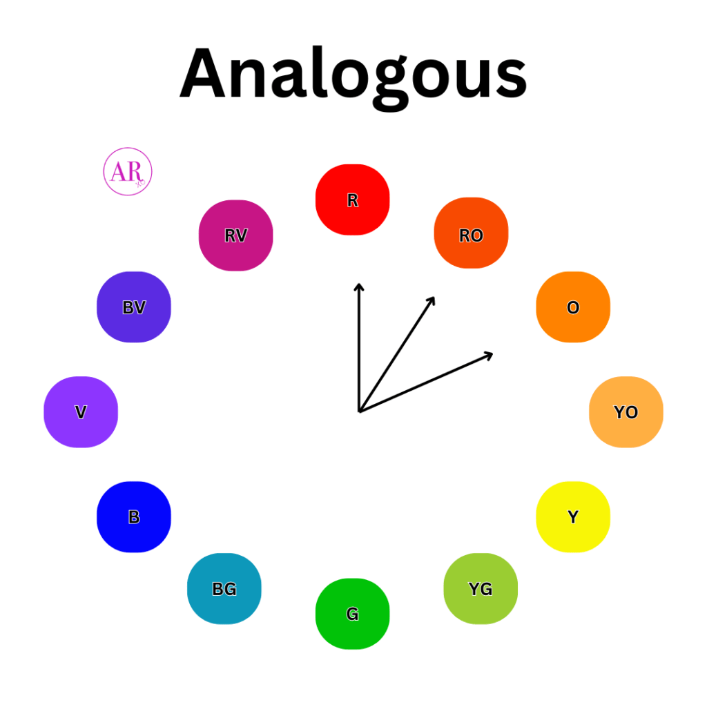
Analogous colors are considered easy to pair. They are two or more colors that are close neighbors on the color wheel.
When working with this color scheme, you are pairing similar tones together that will easily create a harmonious outfit.
For example, you can choose your base color, let’s say yellow as your shirt. Then pair it with a yellow-orange skirt and an orange-tone blazer or jacket.
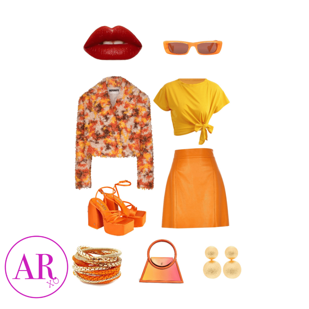
Like this style? Get a similar look here:
Get the Women’s Basic Short Sleeve Scoop Neck Crop Top, and pair it with the Women’s Basic Split Hem High Waist Mini Pencil Skirt, with a chunky cute heel Steve Madden Women’s Cagey Heeled Sandal.
Monochromatic Color Scheme
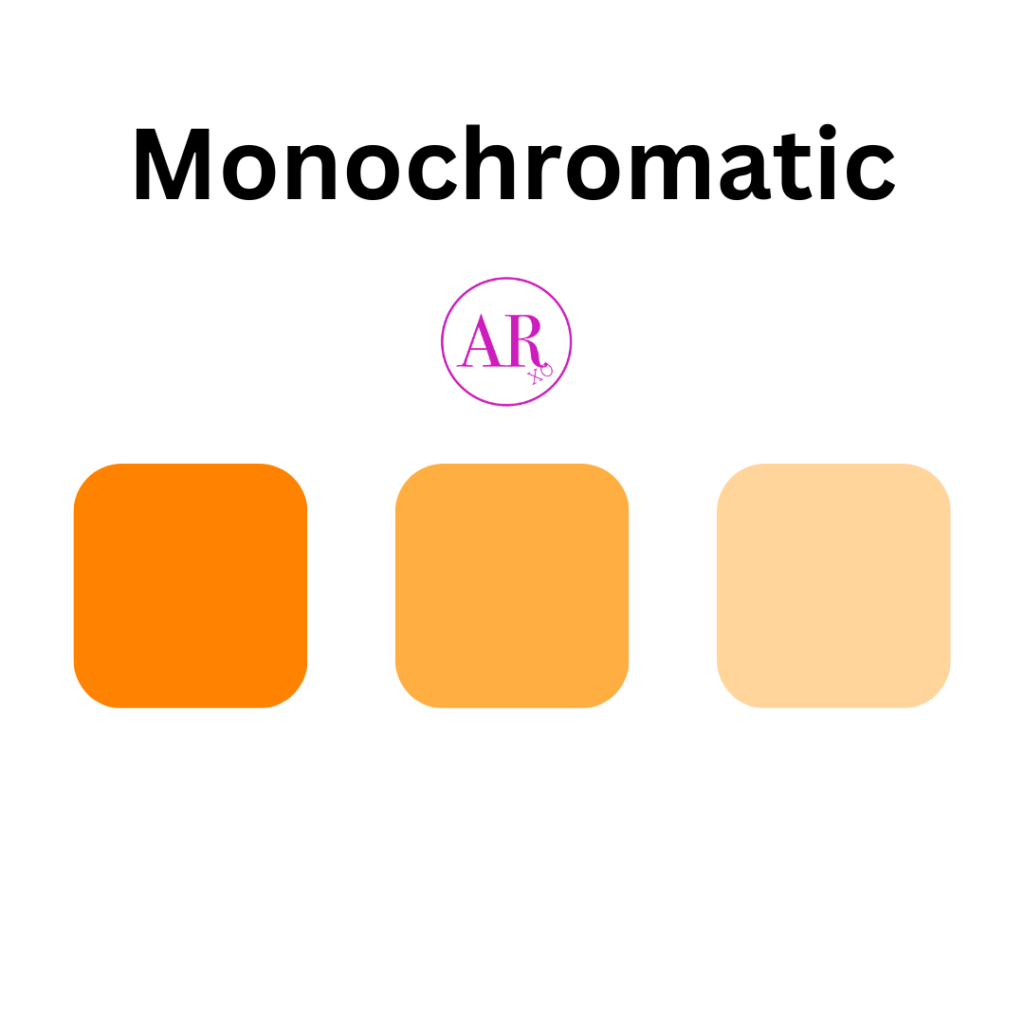
The best thing about the monochromatic or monochrome color scheme is how easy it is to apply to your outfits. This color scheme takes one color and mixes it with a variety of tones and shades of it.
For instance, you can take the color purple (violet) as your base, and mix it with a light pastel purple, and dark purple to complete your outfit. When done right, it is beautiful, balanced, and harmonious.
It takes the complicated pressure off of thinking of what two colors go together if you aren’t comfortable using the color wheel.
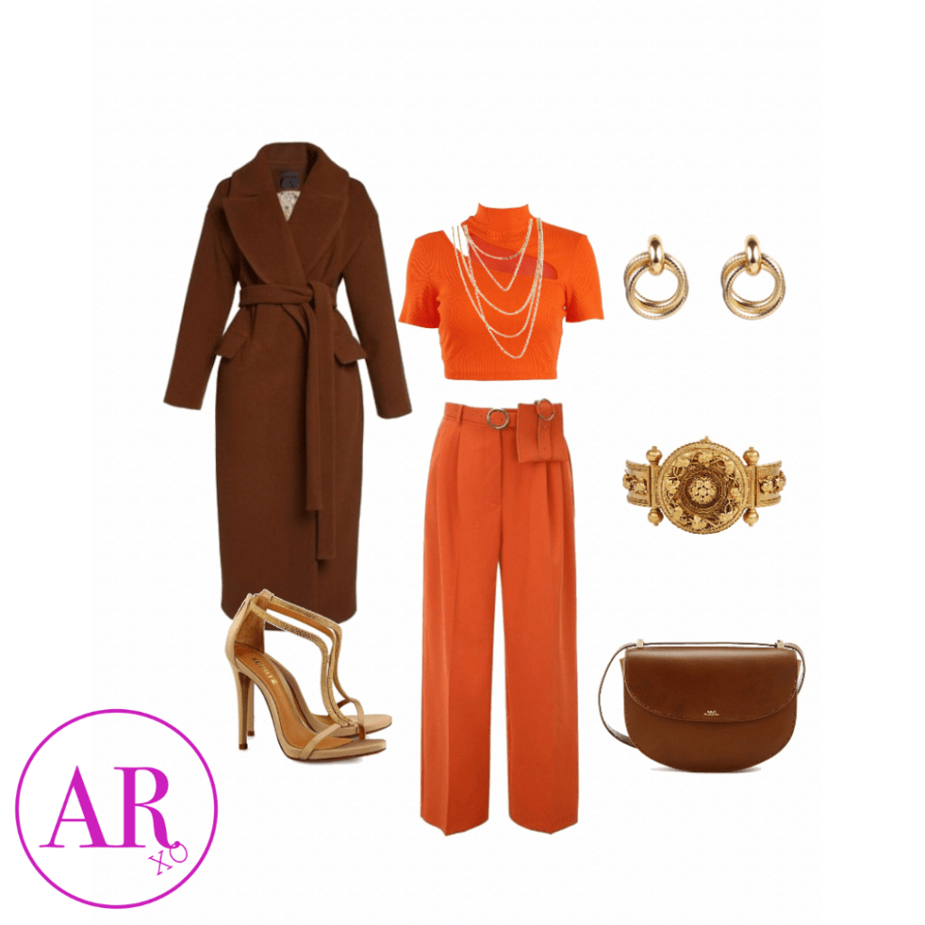
Shop This Look
If you like this monochrome orange look, but don’t want to go too overboard, paint it with this brown Makkrom Women’s Double Breasted Long Trench Coat Windproof Classic Lapel Slim Overcoat with Belt to compliment this Artivaly Women’s Basic Round Neck Short Sleeve Crop Top, and Women’s High Waisted Stretchy Bootcut Pull On Dress Pants Casual Work Pants, but don’t forget about the shoes Stilettos Open Toe Pump Heel Sandals.
Leave a Reply